
Making a Splash with Power BI 💦 Taking the hard work out of Water Asset Management 🚰
- Jill Singleton

- Jun 29, 2024
- 11 min read
Updated: Jun 30, 2024
Water Authorities are entrusted with the responsibility of ensuring there is a sustainable and reliable supply of water to the community. This is a huge responsibility! Efficient management of water assets is a critical component of this responsibility as it directly impacts the quality of service provided to consumers and the long-term sustainability of water resources.

Welcome to the Iamdata Solutions Asset Management Newsletter - July 2024
Having worked with many organisations managing and maintaining water infrastructure assets, I have witnessed firsthand the transformative power of Power BI. I have built many Power BI reports for various clients and there's no doubt about it, Power BI has emerged as a game-changer for these organisations, enabling them to unlock valuable insights from their data and make informed decisions that optimise their operations.
Benefits of Power BI for Water Authorities
In this post, I’m taking a deep dive into how Power BI can help Water Authorities manage their water data more efficiently. Power BI's interactive dashboards and reports provide Water Authorities with real-time insights into critical performance indicators, such as water quality, leakage rates, and the condition of the water asset infrastructure. Power BI can help to monitor these metrics and provide the information in easy to understand visualisations that can help the organisation to proactively identify potential issues and take preventive measures, minimising disruptions in service delivery and reducing operational costs.

So let's deep dive into the many ways Power BI can help!
Forecast Future Demand Patterns
Data Analysis
Power BI enables the analysis of historical water usage data to identify trends and seasonal variations. This helps in predicting future water demand with higher accuracy.
In the example below, I’ve incorporated slices to filter the data by Suburb, Tariff Code, Meter Type, and Year. These filters allow the user to quickly drill down to specific subsets of the water meter data. For example, we can analyse data for a particular suburb, a specific tariff code, or a certain type of water meter. This granular filtering capability enables targeted analysis and decision-making based on the specific criteria relevant to the Authority's operations.

I’ve used a stacked bar chart to show water consumption by suburb. This visualisation provides a clear visual representation of water consumption patterns across different suburbs. Water Authorities can identify suburbs with high or low consumption levels, which can guide resource allocation, infrastructure maintenance, and water conservation efforts. Areas with consistently high consumption may require attention to address potential leaks or inefficient usage.
Using the Narrative to display information in human language very useful as it translates the data into plain language, making it easier for non-technical stakeholders to understand the key insights and findings. This can facilitate effective communication and decision-making across various departments within the Water Authority, ensuring that everyone is on the same page.
I have also included a Card visual showing the number of water meters. This card provides a quick overview of the total number of water meters under the Water Authority's management. It can help with asset tracking, maintenance scheduling, and resource planning for meter replacements or upgrades.
I have also included a Card visual showing water consumption. This card displays the overall water consumption across the entire service area. It can serve as a high-level indicator of water usage trends and help identify potential issues or areas of concern that may require further investigation.
I’ve included a Gauge visual showing the average Leak rate During period (L/h). The gauge visualisation effectively communicates the average leak rate, which is a crucial metric for Water Authorities. A high leak rate can indicate potential water losses, infrastructure issues, or inefficient water distribution systems. This visualisation can prompt immediate attention and targeted maintenance efforts to address leaks and minimise water wastage.
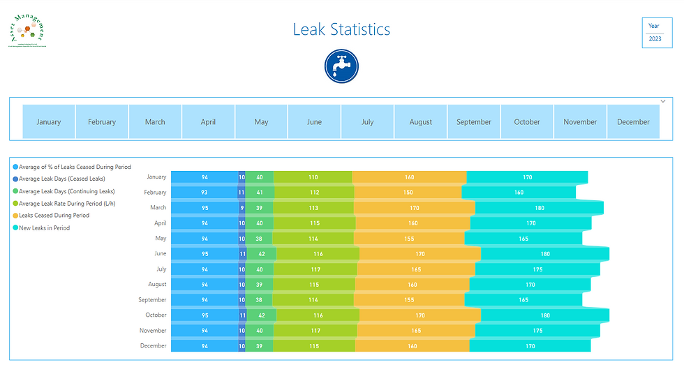
Water Leaks
The line charts found in the dashboard focused on leak related information provides key information and provides valuable insights:
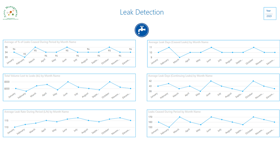
Each of these charts offer a comprehensive understanding of the Water Authority's leak management performance, identify areas for improvement, and make data-driven decisions to enhance the efficiency of their leak detection and repair processes. This can then lead to reduced water losses, cost savings, and better asset management practices, ultimately contributing to the sustainable and efficient management of water resources.
Here's how each visualisation can contribute:
Line chart showing New Leaks in Period (12 months)
This chart tracks the number of new leaks detected over a 12-month period. The Water Authority can identify seasonal patterns or sudden spikes in new leak occurrences, which can help allocate resources for leak detection and repair efforts more efficiently. This information can also guide preventive maintenance strategies and infrastructure upgrades to mitigate future leak occurrences.
Line chart showing the percentage of Leaks Ceased during the period
This visualisation provides insights into the effectiveness of the Water Authority's leak repair and mitigation efforts. A high percentage of leaks ceased during a given period indicates efficient leak management practices, while a lower percentage may suggest a need for improved leak detection and repair processes.
Line chart showing Average Leak Days-Continuing
This chart displays the average number of days a leak continues before being resolved. A prolonged average duration can indicate inefficiencies in the leak detection and repair processes, leading to increased water losses. The Water Authority can use this information to identify bottlenecks and implement strategies to reduce the time required to address leaks.
Line chart showing Average Leak Rate during Period
The average leak rate is a crucial metric that represents the severity of leaks. A high average leak rate may indicate the presence of significant leaks or multiple smaller leaks contributing to substantial water losses. This visualisation can help the Water Authority to prioritise leak repair efforts based on the potential impact and identify areas or assets that require immediate attention.
Line chart showing Leaks Ceased during period
This chart provides a visual representation of the number of leaks successfully resolved during a given period. The Water Authority can use this information to evaluate the effectiveness of their leak repair efforts and make necessary adjustments to improve their performance. Additionally, it can be used to track progress against targets or benchmarks for leak resolution.
Line chart showing Total volume lost to Leaks (kL)
This visualisation quantifies the total volume of water lost due to leaks during a specific period. The Water Authority can use this information to estimate the financial impact of water losses and prioritise leak mitigation strategies based on the potential cost savings. It can also help identify areas or assets with significant water losses, guiding targeted maintenance and infrastructure upgrades.
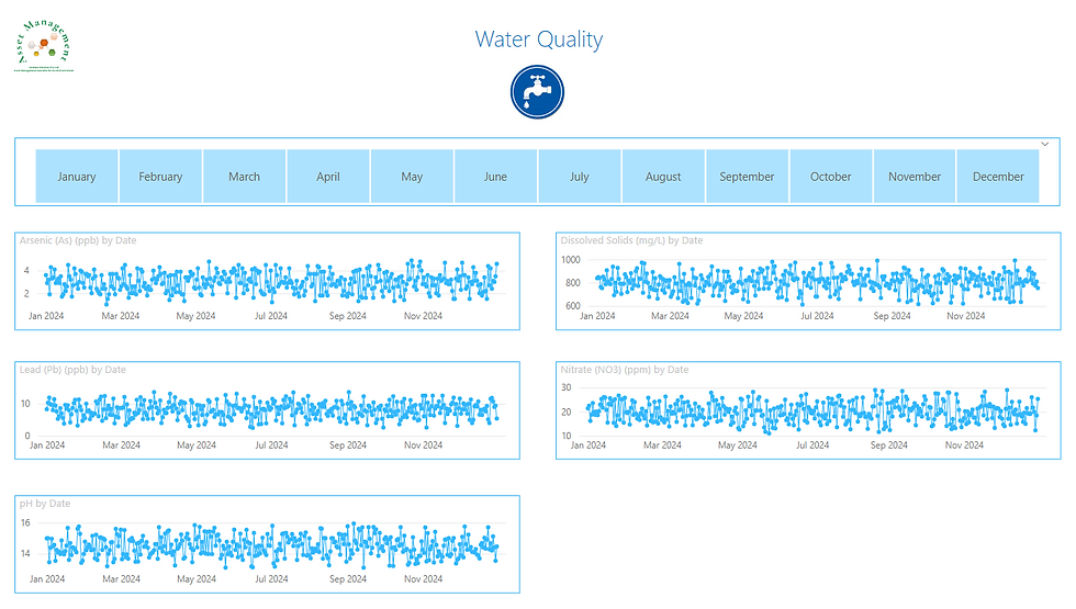
Water Quality
I used line chart visuals to display the water quality data. These line chart visualisations offer clear, comprehensible information and valuable insights. These line charts display the levels of essential water quality parameters over time.
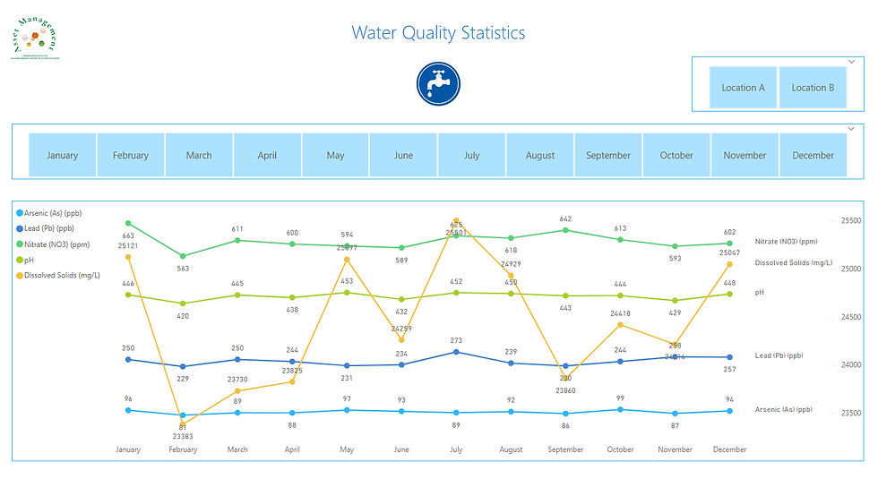
Line charts for Arsenic (As)(ppb), Dissolved Solids (mg/L), Nitrate(NO3)(ppm), and pH
Water Authorities continuously monitor these metrics, and Power BI serves as an excellent tool for analysing the data and presenting user-friendly visuals.
How can these Power BI dashboards help Water Authorities?
Here's a few ways I can think of....
o Identify any deviations from acceptable ranges or regulatory standards, prompting immediate corrective actions.
o Detect trends or patterns that may indicate potential issues with water treatment processes or infrastructure.
o Pinpoint specific assets or locations where water quality concerns arise, enabling targeted maintenance or replacement efforts.
Month slicer
The month slicer allows users to analyse water quality data at different time scales, either month by month or over the entire 12-month period. This feature provides flexibility in identifying seasonal variations or long-term trends in water quality parameters, which can be crucial for effective asset management:
o A monthly view enables the detection of short-term fluctuations or localised issues that may require prompt attention or maintenance.
o A yearly view facilitates the identification of long-term trends, which can guide strategic planning for infrastructure upgrades, treatment process optimization, or asset replacement schedules.
Water Authorities can use this information in the Power BI Reports to proactively address potential issues before they escalate, minimising the risk of water contamination or regulatory non-compliance. These visualisations can also help identify under performing assets or treatment processes, enabling targeted maintenance, repair, or replacement efforts. This targeted approach can optimise resource allocation and ensure efficient asset management practices.
Maintaining high water quality standards is crucial for Water Authorities, as it builds consumer trust and ensures compliance with regulatory and public health requirements. This approach not only protects public health but also safeguards the Water Authority's reputation and minimises potential legal liabilities. Water quality visualisations offer a comprehensive view of performance, enabling data-driven decisions and prioritising asset management efforts. This ensures the delivery of safe and reliable water to customers.
Water and Environmental Monitoring
Flood Prediction - Integrating Data
The Average Rainfall chart on the dashboard displays daily rainfall data, providing critical insights into precipitation patterns. By analysing these trends over time, Water Authorities can better understand seasonal variations and extreme weather events. The Number of Flood Alerts chart shows the frequency of flood alerts, highlighting periods of increased flood risk. This data is essential for identifying correlations between heavy rainfall and flood events.
The map offers geographical data about water stations, including river levels and soil moisture readings when integrated from relevant sensors. This allows for a comprehensive geospatial analysis of water conditions. By examining historical rainfall data alongside flood alerts, the dashboard helps identify correlations between heavy rainfall and flood events. This is evident in the daily trends of rainfall and flood alerts on specific dates. The station map, combined with geo-tagged flood alerts and rainfall data, helps identify flood-prone areas. For example, clusters of flood alerts in specific regions can highlight vulnerable areas.
Using historical data trends shown on the dashboard, predictive models can forecast potential flood events based on expected rainfall. Identifying patterns where certain rainfall amounts consistently lead to flood alerts helps predict future flood risks. By continuously updating with real-time data, the dashboard can trigger early warning systems when certain thresholds, such as specific rainfall amounts or river levels, are met, providing timely alerts to relevant authorities.
The Average Value By Day and Average Rainfall charts provide insights into daily fluctuations in rainfall. Analysing these trends over time helps understand seasonal patterns and extreme weather events. The date range filter allows users to select specific periods for analysis, facilitating the study of rainfall impact over different seasons or during specific weather events.
Understanding rainfall patterns aids in water resource planning, such as predicting water availability and planning for water storage or distribution. Identifying periods of low rainfall helps in drought management and preparing for water scarcity. The treemap visualises how daily values change by station, aiding in the assessment of rainfall impact on different stations. This helps determine which areas receive more or less rainfall, allowing for adjusted water management strategies. The station map, combined with rainfall data, allows for localised analysis. Water Authorities can compare rainfall data with other metrics, such as water levels and soil moisture, at specific stations to better understand local conditions.
Integrating data visualised on this dashboard with predictive analytics tools can help create early warning systems for floods. Automated alerts can be set up when data indicates a high probability of flooding. Water Authorities can use insights from rainfall and flood data to make informed decisions on water releases from dams, reservoir management, and urban planning to mitigate flood risks. A modified dashboard can be shared with the public to inform them about current water conditions and potential flood risks, improving community preparedness. The Power BI dashboard provides a comprehensive view of rainfall and flood data, enabling Water Authorities to predict and manage flood events effectively. It also facilitates detailed rainfall analysis for better water resource management.
Data Access - Power BI - Data Warehouses - Fabric - Onelake - DataLake
Water Authorities typically rely on multiple systems to monitor and manage their water assets. SCADA systems oversee water treatment plants, pumping stations, and distribution networks, while spatial data is key for analysing the spatial distribution of water assets, and asset management systems track the lifecycle and maintenance needs of individual water asset components. Integrating these disparate data sources and bringing this diverse data into one Power BI report is very powerful. Leveraging Power BI in this way can streamline data management and enhance operational efficiency.
Power BI's integration capabilities are innumerable and undoubtedly can revolutionise how Water Authorities (and any organisation for that matter!) manage their assets by connecting to almost any data source, some of the more common being spreadsheets, databases, and cloud services. This flexibility is incredibly useful as it consolidates data from various systems, eliminating the need for manual reconciliation and provides a comprehensive, real-time view of operations.
Power BI connects with IoT devices and sensors used by Water Authorities to monitor water quality, flow rates, and asset conditions. This integration provides a holistic view of water assets, optimising maintenance schedules, predicting equipment failures, and prioritising infrastructure upgrades.
To further enhance data integration and management, Microsoft SQL Server data warehouses can be employed. These data warehouses serve as centralised repositories for structured data, enabling efficient querying and reporting. Coupled with Microsoft Fabric OneLake and DataLake, Water Authorities can also leverage data lakehouse architecture to handle both structured and unstructured data. This approach facilitates the storage and processing of massive volumes of diverse data, offering robust analytics capabilities and seamless integration with Power BI.
This data integration allows Water Authorities to quickly identify trends and anomalies across their assets. For example, if Power BI detects a sudden spike in water consumption or a drop in water pressure, it can immediately alert relevant personnel, enabling prompt investigation and corrective action to prevent larger issues. This proactive approach reduces service disruptions and boosts customer satisfaction.
Interactive Dashboards and Reports
Power BI's interactive dashboards and reports are invaluable for Water Authorities, enabling them to visualise and analyse data comprehensively. Power BI provides the tools to transform complex data into visually appealing and interactive displays. The Power BI reports helps uncover valuable insights, identify improvement opportunities, and makes it easier to make informed decisions about water asset management.
These interactive visualisations allow Water Authorities to delve deeper into their data, revealing hidden insights. Users can filter, slice, and drill down into specific areas of interest, facilitating detailed data exploration. This interactivity is crucial, as it enables quick identification and investigation of anomalies such as sudden changes in water demand, leakage rates, or asset performance, leading to prompt responses and mitigation efforts.
Power BI's dashboards and reports also provide essential information for strategic planning and decision-making. By visualising long-term trends, analysing demographic data, and incorporating environmental factors, Water Authorities can develop comprehensive plans for infrastructure investments, resource management strategies, and sustainability initiatives.
Collaboration and Sharing
Power BI's collaboration features facilitate seamless data sharing and communication among teams within Water Authorities. Dashboards and reports can be shared with stakeholders, enabling them to access real-time information and make informed decisions collaboratively. This collaborative approach fosters transparency, enhances communication, and aligns various departments and teams towards common goals.
So, now you've had a look at what Power BI can offer, is this the game-changer you've been looking for to help you manage your assets? 💡
I've attempted to show how Power BI brings all the data together and helps you track and analyse water usage, water quality and water distribution. This means you can spot trends, foresee problems, and make smarter decisions to manage your water resources better.
The interactive dashboards and reports make it easy to keep everyone in the loop, from your team to the public. Using Power BI can make your operations more efficient, cut costs, and support sustainable water management. It’s a powerful tool that can really help improve how you handle your water systems 💦
Of course, the logic I've built into the Power BI Report for Water Management can be applied to any asset class, not just Water Assets.
Have a play with my Water Assets Interactive Power BI report here: https://www.iamdata.solutions/interactive-power-bi-reports-for-you-to-explore

I have worked on many different projects with my Local Government clients, from designing and developing Power BI Reports, to building SQL Server databases for spatial data, to managing and maintaining GIS and the Asset Management systems. If you'd like to discuss how we might work together, then please email Jill at ➡️ jill.singleton@iamdata.solutions
If you would like to receive the latest Newsletter Blog straight to your inbox, please subscribe here: ➡️ https://www.iamdata.solutions/subscribe
You can read all our Newsletters and Blogs here:➡️ https://www.iamdata.solutions/blog
You may also be interested in our Projects Page:➡️ https://www.iamdata.solutions/past-projects
Check out what our clients say about us here:➡️ https://www.iamdata.solutions/reviews
If you would like to see a particular topic covered in these newsletters, then please let me know about it. The chances are other people will be interested and would like to hear about it too! Please email me at: ➡️ jill.singleton@iamdata.solutions with your suggestions.


תגובות